In this article
- The actual job I needed the video to do
- The shortcut: use HTML and CSS as the video template
- Why this worked better than fighting templates
- The four-scene structure
- The actual workflow
- The little details that mattered
- A tiny example of the idea
- A tiny animation example
- What this approach is good for
- What this approach is not good for
- Why I like it
- Final thought
I wanted a simple video template for promoting new Old Stack Journal articles on TikTok, Instagram Reels, and YouTube Shorts.
Nothing cinematic. Nothing with exploding particles, fake 3D glass panels, or a person in a blazer pointing at captions. Just a clean announcement clip with the article title, a few useful points, and a prompt to read the full post.
That sounds easy until you open a design tool.
I tried Canva because that is the obvious answer. It has templates, video tools, animations, stock assets, music, AI features, and enough buttons to make you briefly wonder if you have accidentally joined a media company. Canva is good at helping normal people make things look less terrible, but it can also become its own little productivity swamp. You start with “I need a quick article promo” and somehow end up choosing between seventeen animated blob transitions and a font called something like Founder Spark Pro.
This is not really Canva’s fault. It is doing what a design tool does. The problem is that I’m not a graphics person (although I was bloody dangerous with FrontPage 98). I’m a web person. I understand boxes, margins, typography, links, CSS variables, and layouts that don’t try to impress me. The moment I have to become a part-time motion designer just to promote a blog post, the whole thing starts to feel upside down.
So I gave up trying to design the video in Canva and made the template with HTML and CSS instead.
That turned out to be a much better fit.
The actual job I needed the video to do
The useful thing about getting frustrated with a tool is that it forces you to define the job properly.
I didn’t need a full video production system. I didn’t need a brand studio. I definitely did not need a social media content engine with forty reusable scenes and a subscription that costs more than the hosting bill.
I needed a repeatable article announcement format.
The video had to:
- announce a new Old Stack Journal article
- match the site style
- work as a vertical 9:16 clip
- be readable on a phone
- be easy to reuse for every new article
- include the article date
- include a few useful points from the post
- end with a clear “read the full post” message
- export cleanly for YouTube Shorts, Instagram Reels, and TikTok
That’s a small job. But small jobs can still become fiddly if the tool pushes you toward a workflow you don’t enjoy.
Old Stack Journal already has a visual language. Warm off-white background. Charcoal text. Muted green and rust accents. Subtle borders. Simple panels. System fonts. A slightly old-web, practical journal feel.
All of that already exists as CSS.
So instead of asking a design tool to imitate the site, I used the same kind of layout thinking the site already uses.
The shortcut: use HTML and CSS as the video template
The basic idea is simple:
Create one local HTML file that looks like a vertical video frame.
Inside that file, add four animated “scenes”:
- a hook slide with the article title
- a “what it covers” slide with three points
- a short opinion/punchline slide
- a final call-to-action slide
Then open that HTML file in a browser, record it with OBS, trim it in Clipchamp, add a soundtrack, and export it as a vertical MP4.
That sounds slightly ridiculous when you say it out loud, but it is very practical if you are comfortable with HTML and CSS. It turns the job from “design a social video from scratch” into “edit a few text placeholders in a file.”
The system is not trying to replace proper video editing. It is just a small shortcut for making clean article promo clips without having to become a video person by accident.
Why this worked better than fighting templates
A lot of video templates are designed for a different kind of internet.
They assume you want bright gradients, big reaction energy, fake urgency, swooshes, animated emojis, and phrases like “you won’t believe this.” That might work for some niches, but it is the exact wrong feeling for a practical tech journal.
Old Stack Journal is not trying to look like a crypto webinar. It isn’t trying to sell a course about unlocking your builder mindset. It is a small, practical site about tools, workflows, old-stack thinking, and building useful things on the web.
The HTML approach let me keep that feel.
I could use the same colours as the site. I could use the same panel style. I could use the same typography. I could keep the motion restrained. I could avoid the whole “AI sparkle dashboard” look that seems to infect every tool promo if you leave it unattended for more than seven seconds.
More importantly, I could make the template reusable.
Once the structure worked, each new article only needed new text:
- article title
- article date
- hook line
- three bullet points
- one punchy summary line
- footer topics
That is exactly the kind of repeatable system I like. Not fancy. Just useful.
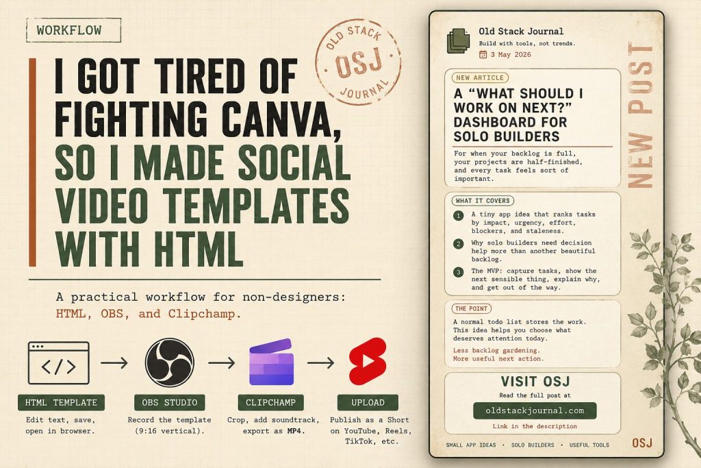
The four-scene structure
The template I ended up using has four scenes. Each one has a job.
Scene 1: the hook
The first scene is there to make someone understand what the post is about quickly.
It includes:
- the Old Stack Journal logo
- the article date
- a “New article” label
- the article title
- one hook line
For example, for an article about a “What should I work on next?” dashboard, the hook might be:
For when your backlog is full, your projects are half-finished, and every task feels sort of important.
That is better than just throwing the title on screen and hoping people care. The hook gives the article a reason to exist.
Scene 2: what it covers
The second scene gives the viewer three quick reasons the article might be useful.
For a small app idea post, that might look like:
- a tiny app idea that ranks tasks by impact, urgency, effort, blockers, and staleness
- why solo builders need decision help more than another beautiful backlog
- the MVP: capture tasks, show the next sensible thing, explain why, and get out of the way
This scene does not need to explain the whole article. It just needs to tell the right person, “yes, this is probably worth opening.”
Scene 3: the point
The third scene is where the video gets a little more OSJ.
This is not just a summary. It is the opinion or practical point behind the article.
For the dashboard article, the line was:
A normal todo list stores the work. This idea helps you choose what deserves attention today.
That is the difference between a bland promo and something that actually feels like the site. The video is not just saying “new post exists.” It is saying why the post exists.
Scene 4: the call to action
The final scene is simple:
Visit OSJ
Read the full post at oldstackjournal.com
Link in the Bio
One small lesson here: don’t put “click here” inside the video.
The video itself is not usually the clickable part, especially once it’s on TikTok, Instagram, or YouTube Shorts. The actual link might be in the description, the caption, the profile, or wherever that platform decides links are allowed to live this week.
So the video CTA needs to be visual and memorable, not literally clickable.
The actual workflow
Once the HTML template exists, the production process is fairly straightforward.
Step 1: create the article-specific HTML file
For each article, I make a copy of the base template and change the text.
The placeholders are things like:
[ARTICLE TITLE]
[ARTICLE DATE]
[HOOK LINE]
[BULLET 1]
[BULLET 2]
[BULLET 3]
[POINT / QUOTE]
[FOOTER TOPICS]
The logo sits beside the HTML file as a normal image file, for example:
osj-logo.pngThere is no build step. No npm. No video generation service. No mystery export panel. It is just a local HTML file.
Step 2: open the HTML file in the browser
I open the HTML file in Chrome and let the CSS animation run.
The page is designed as a 9:16 vertical frame, so it behaves like a little video canvas inside the browser.
This is also where I can quickly check whether the text is too long. Text that looks fine on a desktop screen can be too much for a short vertical video. If the viewer cannot read it comfortably, the template is not doing its job.
Step 3: record the browser with OBS
OBS is the screen recording part of the workflow.
The basic setup is:
- set the OBS canvas to vertical
- use a 9:16 layout
- add the browser window as a source
- crop the source so only the HTML video frame is visible
- fit that source to the OBS canvas
- record the animation
The first time I tried this, it looked weird because OBS was capturing the whole browser area and fitting it into a vertical canvas. That left a lot of strange empty space around the actual template.
The fix was simple once I understood it: crop the browser source so only the template frame is visible, then fit that cropped source to the OBS canvas.
A useful habit is to record two full loops. That gives you enough clean footage to trim out one good loop from the middle instead of trying to start and stop the recording perfectly.
Step 4: trim it in Clipchamp
Clipchamp is not doing the creative heavy lifting here. It’s just doing the practical video editing work:
- import the OBS recording
- set the project to vertical
- trim off the messy start
- trim off the loop overlap at the end
- crop/fill if needed
- add a soundtrack
- export as an MP4
That is a good use of a video editor. I don’t want Clipchamp to design the whole thing. I just want it to help me cut, crop, add audio, and export.
Step 5: upload it as a short-form promo
Once exported, the same video can be used as a short vertical promo for:
- YouTube Shorts
- Instagram Reels
- TikTok
- possibly Facebook/Threads/X depending on how you want to post
The caption or description should include the actual article link. The video tells people what to look for. The post text gives them the link.
The little details that mattered
A few practical lessons showed up quickly.
First, the text needs to be larger than you think. A tasteful desktop layout can become unreadable once it is compressed into a phone video. Short-form video is not a webpage. It is closer to a moving poster.
Second, the transitions need to be slower than they feel while editing. When you know what the text says, it is easy to underestimate how long someone else needs to read it. I slowed the template down because the first version moved too quickly for the amount of content on screen.
Third, the final card should fade out. That makes it much easier to create a clean loop or trim a complete version in Clipchamp.
Fourth, don’t add too many words. This is still a promo, not the article itself. The aim is to make someone interested enough to read the post.
Fifth, the template should not try too hard. Once it becomes a giant animated production, the whole shortcut starts to collapse under its own cleverness.
A tiny example of the idea
This is not the full OSJ template, but it shows the basic shape of the approach.
You can make a vertical HTML card like this:
<div class="video-card">
  <p class="kicker">New article</p>
  <h1>[Article title goes here]</h1>
  <p class="summary">A short reason someone should read the post.</p>
  <p class="url">example.com</p>
</div>
And style it as a 9:16 frame:
.video-card {
  position: relative;
  width: 1080px;
  height: 1920px;
  padding: 120px;
  background: #f5f0e6;
  color: #25211b;
  font-family: system-ui, sans-serif;
}

.kicker {
  color: #9b5a35;
  font-family: monospace;
  text-transform: uppercase;
  letter-spacing: 0.08em;
}

h1 {
  margin-top: 80px;
  font-size: 96px;
  line-height: 1;
  letter-spacing: -0.06em;
}

.summary {
  margin-top: 40px;
  font-size: 42px;
  line-height: 1.3;
  color: #756d61;
}

.url {
  position: absolute;
  bottom: 120px;
  font-family: monospace;
  font-size: 34px;
}
That alone could become a static promo image or a simple recorded screen. You don’t need to start with a complex animation.
A tiny animation example
If you want a basic two-scene animation, the core idea is just CSS keyframes.
<section class="scene scene-one">
  <h1>New post</h1>
  <p>[Article title]</p>
</section>

<section class="scene scene-two">
  <h1>What it covers</h1>
  <p>[Three quick points]</p>
</section>
.scene {
position: absolute;
inset: 0;
display: grid;
place-content: center;
padding: 100px;
opacity: 0;
animation-duration: 16s;
animation-iteration-count: infinite;
}
.scene-one {
animation-name: firstScene;
}
.scene-two {
animation-name: secondScene;
}
@keyframes firstScene {
0%, 10% {
opacity: 0;
transform: translateY(20px);
}
15%, 45% {
opacity: 1;
transform: translateY(0);
}
50%, 100% {
opacity: 0;
transform: translateY(-20px);
}
}
@keyframes secondScene {
0%, 50% {
opacity: 0;
transform: translateY(20px);
}
55%, 85% {
opacity: 1;
transform: translateY(0);
}
90%, 100% {
opacity: 0;
transform: translateY(-20px);
}
}That is the whole trick. You are not rendering video in the browser. You are using the browser as the layout and animation engine, then recording the result.
It is a little odd, but it works.
What this approach is good for
This is a good fit if you:
- run a blog or small content site
- want quick article promo videos
- are more comfortable editing HTML than dragging layers around a design tool
- already have a visual style on your website
- want consistency across posts
- don’t need complicated video effects
- like repeatable workflows
It’s especially useful for solo builders because it does not require adding a whole new creative discipline to the pile. You can make one good template and reuse it.
The hard part with social posting is not making one thing. It is making the process repeatable enough that you will actually do it again.
What this approach is not good for
This is not the best option if you want proper motion graphics, talking-head edits, fancy transitions, platform-native effects, or complex video storytelling.
It is also not ideal if you hate HTML and CSS. The whole benefit comes from using the web tools you already understand.
If you are happiest in Canva, use Canva. If you have a proper video editor and know how to use it, use that. The point is not that HTML is the “correct” video tool. The point is that it can be a useful shortcut when the normal tools make a small job feel bigger than it needs to be.
Why I like it
The thing I like most about this workflow is that it turns social video into a publishing step instead of a design crisis.
Before, the process felt like:
Open a design tool and hope I feel creative.
Now it feels more like:
Paste in the article title, write three useful points, record the template, trim it, export it.
That is a much better shape for a solo workflow.
It also keeps the video close to the site’s identity. The promo looks like Old Stack Journal because it is built from the same kind of design decisions as the site itself. Same colours, same typography style, same panel logic, same practical tone.
There is something funny about using HTML and CSS to make videos for TikTok and YouTube Shorts, but it also makes sense. The browser is already very good at layout. CSS is already very good at styling panels, text, borders, spacing, and small animations. OBS is good at recording the screen. Clipchamp is good enough for trimming and exporting.
Put those together and you have a useful little production line.
Final thought
This is not the world’s most advanced video workflow. That’s part of the appeal.
It is a small system for turning articles into simple promo clips without needing to become a designer, video editor, or social media production team.
The funny part is that the most normal web tools in the world ended up being the easiest way to make the video look like the website.
Useful beats flashy, even when the output is a video.
Stay tuned for part two where I plug this system into the OSJ Social Desk plugin for WordPress.