In this article
- What Automation Receipts Does
- Why the Old UI Had Reached Its Limit
- Why Tabler Made Sense
- The First Mistake: Treating Tabler Like a Component Swap
- How I Migrated It
- Public Pages: Making the Product Feel Real
- Docs: The Biggest Visual Improvement
- Auth and the App Shell
- The Receipt Detail Page Was the Important One
- Cleanup Was Part of the Migration
- What Stayed Simple
- What I Learned
- What Comes Next
Automation Receipts started the way a lot of useful side projects start. The endpoint worked first. The app could receive a workflow run, store the important pieces, show a readable receipt, list timeline events, record review status, and export the whole thing as Markdown. That was the part that mattered first. The point of the product was never to win a design award. It was to take something that normally disappears into logs, browser tabs, webhook payloads, or tool history screens, and turn it into a plain receipt someone can read later.
But once the core idea started working, the interface started to matter more.
Automation Receipts had moved past the “does this idea work?” stage. It had a public homepage, docs, login and registration screens, a dashboard, API keys, automations, runs, receipt detail pages, admin user approval, a setup fallback, a 404 page, and a growing set of docs for n8n and custom scripts. Every new page needed another layout decision. Every table needed another table style. Every card needed a slightly different class. Every bit of spacing became one more small custom choice.
That’s fine for the first few pages. It’sn’t fine once the app starts becoming a real product.
So I rebuilt the interface around Tabler.
Not because Automation Receipts needed to look trendy. Not because I wanted to turn it into a huge admin platform. I used Tabler because the app needed a real UI system underneath it, and I wanted to keep the actual stack simple: PHP, MySQL, Apache, plain views, static CSS and JavaScript. No React rewrite. No Vite build step. No frontend framework just for the sake of it.
The goal was simple: keep the product, keep the backend, keep the routes, keep the receipt logic, and stop hand-building the interface one panel at a time.
What Automation Receipts Does
Automation Receipts creates readable receipts for workflows that do real work.
The core promise is still:
Add one HTTP request to your workflow and get a readable receipt of what happened.
That workflow might be an AI-assisted support reply drafter. It might be an n8n workflow. It might be a custom PHP script, a cron job, an internal admin tool, or some Zapier-style automation that updates a CRM, sends an email, summarises a document, or checks something on a schedule.
The important thing isn’t the platform. The important thing is that something happened, and later you want a readable record of it.
Automation Receipts records a run. A run can have a status, a source, a risk level, an input summary, an output summary, a final action, timeline events, and optional review status. It also gives you a Markdown export, because sometimes the best “integration” is still a clean text record you can copy, archive, or paste somewhere else.
That’s the product. Tabler didn’t change that. It gave the product a better surface.
Why the Old UI Had Reached Its Limit
The original interface was good enough for the MVP. It was plain, readable, and mostly did the job. I could build a page quickly, add a panel, style a table, make a button, and move on.
The problem was that each new page added another custom decision.
The public pages had one kind of layout. The docs had another. The app pages had their own cards and tables. Auth screens were separate again. The receipt detail page needed to feel more like a readable document than a dashboard row. Admin pages needed forms and status badges. API key pages needed warnings and secret handling. Each area was drifting into its own little visual system.
That’s where custom CSS starts to get expensive. Not because any single class is hard, but because the whole app becomes a memory test. What did I call that card? Which panel style did I use on this page? Why is this table spacing different? Did I already make a mobile version of this layout? Is this old class still used anywhere?
When you’re building something part-time, that overhead matters. You might not come back to a page for a week. You might be working at night after doing something else all day. You don’t want to spend half the session remembering which folder is the active copy, which CSS file still matters, or whether a class name belongs to the current app or last week’s design experiment.
A UI system doesn’t solve the product for you, but it removes a lot of those small decisions.
Why Tabler Made Sense
Tabler made sense because it fits the way Automation Receipts is built.
This is still a PHP/MySQL app. It runs on a normal LAMP-style setup. The views are PHP files. The routes are handled by the app’s front controller. The CSS and JavaScript are static assets. I didn’t want the UI migration to drag the whole project into a new frontend stack.
Tabler works well for that. It gives you proper app layouts, cards, tables, forms, badges, alerts, empty states, docs-style content, auth screens, dropdowns, and detail pages without forcing the app to become a React project.
That mattered more than it probably sounds.
I didn’t want to add Node, Vite, Sass, Liquid, Eleventy, or a Tabler build step to Automation Receipts. I wanted the app to keep being simple. The local Tabler project became a reference library. Automation Receipts got the compiled Tabler CSS, JavaScript, fonts, and a small project override file.
That means future pages can use Tabler classes and patterns, but the app still deploys like a normal PHP app.
That’s the kind of trade-off I like. Use the tool where it helps. Do not let the tool take over the project.
The First Mistake: Treating Tabler Like a Component Swap
The first pass wasn’t quite right.
It’s very easy to use a UI library as a component swap. Replace the old panels with Tabler cards. Replace old buttons with Tabler buttons. Tweak the CSS a little. The page looks better, but underneath it’s still the old page with new clothes.
That wasn’t what I wanted.
If the old layout was the problem, keeping the old layout and changing the class names wasn’t enough. The app needed to follow Tabler’s page patterns, not just borrow its widgets.
So the rule became simple:
If a page is being converted to Tabler, make it a Tabler-native page.
That doesn’t mean copying demo text or stuffing the app full of fake dashboard sections. It means using the real Tabler page structure where it fits. The public pages should feel like public product pages. The docs should feel like docs. The authenticated app should feel like an app. The receipt detail page should feel like a readable document.
The PHP logic stayed. The routes stayed. The form actions stayed. CSRF fields stayed. API behavior stayed. Markdown export stayed. The page structure changed.
That distinction made the whole migration better.
How I Migrated It
I didn’t start with the hardest page.
The order mattered:
- Public pages
- Auth pages
- Docs
- Authenticated app shell
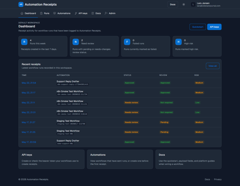
- Dashboard and app pages
- Receipt detail page
- Fallback pages and cleanup
Public pages were a good starting point because they were lower risk. If the About page looks slightly off, that’s annoying, but it’sn’t going to break receipt review or API key creation. It also helped settle the direction: use Tabler’s public/marketing patterns, not a lightly restyled version of the old site.
Auth pages came next. Login, registration, and the pending registration screen were straightforward. Tabler already has good centred auth patterns, and those pages didn’t need the full app shell.
Docs were the first big win. I used the Tabler docs style as the reference rather than trying to force docs into a marketing page or an app table. That gave the docs a left navigation, a mobile docs menu, proper code blocks, tables, callouts, and a better reading rhythm.
The authenticated app came after that. I chose Tabler’s horizontal layout because Automation Receipts doesn’t need a huge vertical sidebar. The app has a focused set of pages: Dashboard, Runs, Automations, API keys, Docs, and Admin when needed. A horizontal app nav fits that better.
The receipt detail page came last because it’s the core product surface. That page holds the receipt itself. It has the timeline, input summary, output summary, final action, review status, approval notes, Markdown export, and review actions. If that page broke, the product would feel broken, even if the rest of the app looked better.
Public Pages: Making the Product Feel Real
The public side now has a proper product shape.
The homepage, About, Pricing, FAQ, Privacy, Disclosure, Newsletter/Updates, and Changelog pages all live inside the same Tabler direction. The header is consistent. The footer is consistent. The language has also moved away from making the product sound like it’s only designed for AI workflows.
Automation Receipts can absolutely be used for AI-powered workflows. That’s one of the strongest use cases. But the product itself is broader than that. It’s a receipt layer for workflows that do real work. An n8n workflow, a custom script, a cron job, or an internal tool can all send a receipt.
The public pages needed to say that clearly.
I also added a Changelog page based on Tabler’s changelog layout. For now it’s static, but it gives the project a place to show what has changed without turning every update into a blog post or a social media thread.
Docs: The Biggest Visual Improvement
The docs were probably the most satisfying part of the migration.
Before the Tabler pass, the docs were useful, but they didn’t feel like a proper documentation section. After the migration, they have a left-hand docs nav, grouped sections, a mobile docs menu, code blocks, tables, callouts, and proper page rhythm.
The docs now cover:
- Quickstart
- Payload fields
- n8n
- Custom scripts
- Support Reply Drafter recipe
That’s important because it proves the app isn’t just a landing page wrapped around an endpoint. There’s a real workflow behind it. You can create a receipt. You can append events later. You can use n8n. You can use a script. You can read what fields mean. You can follow a recipe.
The docs did need a follow-up spacing pass. That’s normal after a migration like this. Code blocks were too close to callouts in a few places. Tables needed more breathing room. One small badge on the payload fields page didn’t fit its column properly. Screenshots with red circles were useful here because they pointed to actual layout annoyances rather than vague “make it nicer” feedback.
Auth and the App Shell
The authenticated app now uses Tabler’s horizontal layout.
That was deliberate. A big sidebar would have made Automation Receipts feel heavier than it’s. The app doesn’t have fifty sections. It has a small set of important ones.
The main app navigation is now built around:
- Dashboard
- Runs
- Automations
- API keys
- Docs
- Admin, when the user is an admin
The user menu, theme toggle, logout form, and admin visibility all had to be preserved. This is where UI migrations can get dangerous. It’s easy to think you’re “just changing layout” and accidentally change how logout works, how CSRF is handled, or which users can see the admin link.
Later in the migration, I also unified the public and app headers around the same horizontal Tabler style. Logged-out users see public navigation. Logged-in users see app navigation. The docs keep their left nav, but the top header now fits the rest of the product.
That made the whole thing feel less like “public website over here, app over there” and more like one product.
The Receipt Detail Page Was the Important One
The receipt detail page was the page I cared about most.
It would have been easy to turn it into a generic admin detail screen, but that would’ve been a mistake.
A receipt needs to be readable. It needs to show the run identity, source, status, review state, input summary, output summary, final action, timeline events, approval notes, and export actions without making the user feel like they are reading a database dump.
That page now uses a more document-like Tabler layout. It has status badges, facts, sections, timeline entries, review controls, notes, and Markdown export.
The important part is what didn’t change.
The Markdown export still works. The copy Markdown button still works. The review actions still post to the same routes. The notes textarea kept the same name. CSRF stayed in place. Timeline order stayed as it was. The run data came from the same variables.
That’s the whole point of a careful UI migration. The product should feel better without becoming a different product underneath.
Cleanup Was Part of the Migration
The migration didn’t end when the pages looked good.
There was cleanup work after that:
- old
styles.cssremoved - old workflow slider JavaScript removed
- old workflow images removed
- old brand SVG removed
- old non-Tabler layout fallback removed
- old docs nav fallback removed
- 404 page converted to Tabler
- setup/no-schema fallback converted to Tabler
tabler-marketing.cssscoped more carefully- Umami analytics scoped to public/docs pages
- Markdown export heading changed from “AI Automation Receipt” to “Automation Receipt”
That cleanup matters because old systems linger forever if you let them. You think you have migrated, but the app still has old layout branches, old assets, old CSS files, and old mental baggage sitting around waiting to confuse you later.
I didn’t delete everything blindly. The cleanup started with a read-only audit. That audit checked references before anything was removed. The setup page was kept because it’s still routed when the database schema is missing. The demo support receipt script was kept because it’s still referenced in project docs. Runtime logs were left alone because those are local files that shouldn’t be committed anyway.
That’s the kind of cleanup that keeps a project safe.
What Stayed Simple
The best part is what didn’t get added.
There was no database migration for the Tabler work. No Node build system. No new frontend framework. No settings feature slipped in during the redesign. No billing system. No plan management. No usage dashboard. No Tabler customizer panel. No heavy JavaScript because the demo had one.
Automation Receipts stayed a PHP/MySQL app.
The Tabler reference project exists locally as a read-only reference. The app itself uses compiled Tabler assets copied into public/assets/vendor/tabler. Any Automation Receipts-specific fixes live in public/assets/tabler-overrides.css, which should stay small.
That’s a good balance. The app gets the design system without inheriting the whole build system.
What I Learned
The biggest lesson is that a UI framework is most useful when you use its page patterns, not just its component classes.
A card isn’t a design system. A button isn’t a layout. If the page underneath is still a pile of custom sections, you have not really simplified much.
The second lesson is to migrate risky pages last. Public pages can go first. Docs can be shaped separately. Auth pages can use their own pattern. The receipt detail page should wait until the app shell and supporting pages are stable.
The third lesson is that audits are worth the time. Read-only audits before cleanup saved a lot of guessing. They made it clear which files were safe to remove, which files needed to stay, and which weird fallback pages were still routed.
The fourth lesson is very practical: local URLs matter. In this case, http://receipts/ was the older local copy and http://receipts-tabler/ was the active Tabler migration. That’s exactly the sort of thing that can waste an hour if you only work on a project part-time and come back to it after a few days.
The final lesson is that commit hygiene matters when a UI migration brings in vendor assets. Before committing, I’d to make sure the Tabler assets were included, old assets were deleted intentionally, .env stayed out, and runtime session/log files didn’t sneak into Git.
What Comes Next
The Tabler migration is now merged and working locally. The public pages, docs, auth screens, app pages, receipt detail page, 404 page, and setup fallback all use the new direction.
There’s still things to fine tune.
Over the next few days I’ll be going back through the public pages and tightening the copy, spacing, screenshots, and product explanations. The migration gave the app a stronger structure, but the public side still deserves a proper content pass now that the design is stable.
There’s also a future settings area I want to add for registered users. That would likely include basic profile details, maybe an avatar or logo, receipt identity settings, and later possibly usage, plan, payment, upgrade, or downgrade information. That’s a product feature though, not part of the UI migration.
There’s also bigger workflow ideas still sitting in the background, like approval callbacks, more recipes, PDF receipts, Slack delivery, text notifications, and chained receipts across multi-step workflows. Those can wait.
For now, the important thing is that the app has a stronger base.
The endpoint was already working. The receipt system was already taking shape. What Tabler changed was the surface around it. Automation Receipts now has room to grow without every new page becoming another custom CSS decision.
And for a part-time project, that matters more than it sounds.