In this article
- The app had signals, but the page needed to catch up
- Adding sortable route columns
- Sorting is not just a table feature
- Making the control panel less scattered
- Badges helped reduce repeated text
- The route table needed better data behind it too
- UI polish is not decoration
- Keeping the Best Runs section stable
- What worked
- What still needed work
- What I learned in Week 3
Week 2 was about turning raw market data into route decisions. The app had started to move past “here are some routes” and toward “these are the routes worth checking first”. It had a visible decision score, route quality logic, and character location context, which made the recommendations feel more grounded.
Week 3 was where the interface started to take shape.
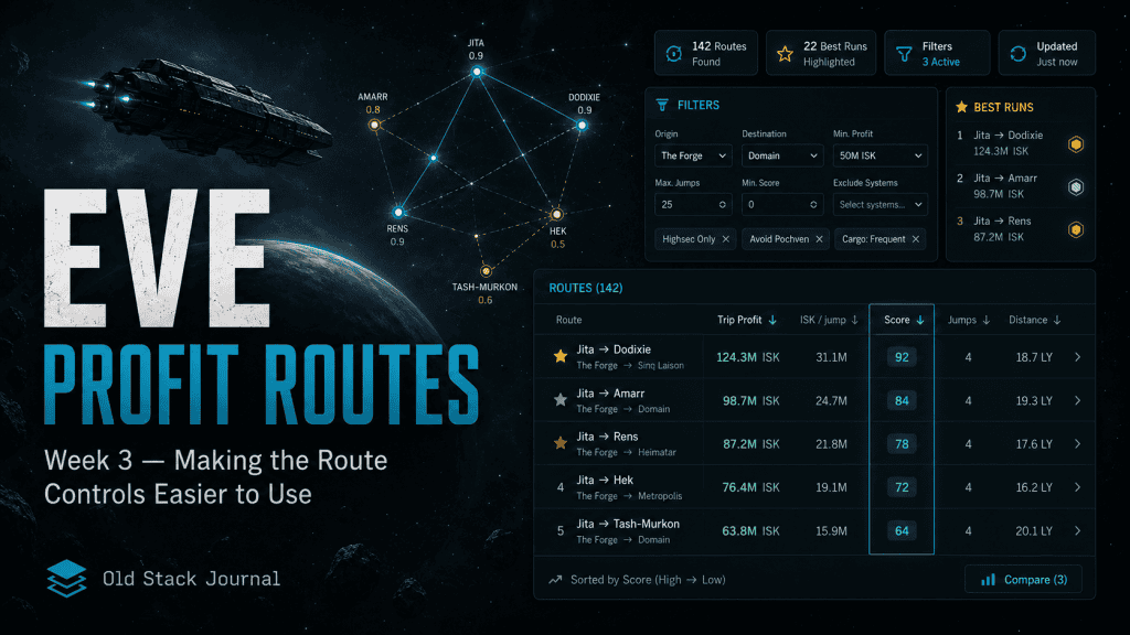
That might sound like a smaller job, but it wasn’t. Once the app has useful route signals, the next problem is whether the pilot can actually work with them without getting annoyed. A route tool can have good logic underneath it and still feel clumsy if the controls are awkward, the table is hard to compare, or the important numbers are buried in the wrong place.
This was the week where EVE Profit Routes needed to become easier to scan, filter, and use.
The product question was still the same:
What should I haul right now to make ISK?
But now the follow-up question was:
How quickly can I see why one route is better than another?
That’s a different kind of product problem. Less glamorous than route scoring, maybe, but just as important if the tool is meant to be used more than once.
The app had signals, but the page needed to catch up
After Week 2, the app had more useful route information than it did at the start. It had scores, confidence, route quality thinking, and the beginnings of character context.
That was good.
The problem was that the page now had to help the player move through all of that information without turning into a cockpit full of blinking nonsense.
This is one of the traps with practical tools. You add useful data, then you accidentally make the screen harder to use because every new signal wants space.
Profit matters. Jumps matter. Score matters. Wallet state matters. Trust matters. The route explanation matters too, especially if the app is going to recommend something with confidence.
At some point, the page needs to stop behaving like a pile of output and start behaving like an interface.
That was the main Week 3 shift. The app didn’t just need more route intelligence. It needed better route handling.
Adding sortable route columns
One of the first improvements was making the main route table sortable.
The table already showed route data, but a static table can be frustrating when you’re trying to compare opportunities quickly. Sometimes you want to sort by trip profit. Sometimes you care about ISK per jump. Sometimes you want to see the highest score. Sometimes you want the shortest run.
The table headers changed from plain headings into sortable controls:
<th class="sortable" data-sort="profit">Trip profit <span class="sort-indicator"></span></th>
<th class="sortable" data-sort="iskPerJump">ISK / jump <span class="sort-indicator"></span></th>
<th class="sortable" data-sort="score">Score <span class="sort-indicator"></span></th>
<th class="sortable" data-sort="jumps">Jumps <span class="sort-indicator"></span></th>
That’s a small change in the markup, but it changed how the table could be used.
The player was no longer stuck reading the routes in one fixed order. They could quickly ask different questions of the same data.
Which route pays the most? Which route gives the best return per jump? Which one has the strongest score? Which one is short enough that I might actually bother running it before making another coffee?
For EVE hauling, those are not the same question.
A high-profit route might be too long. A short route might be lower profit but easier to run. A high score might reflect a better mix of profit, confidence, and practicality. Sorting gives the pilot a way to explore those trade-offs without leaving the page.
Sorting is not just a table feature
The useful bit about sorting is not the JavaScript itself. The useful bit is that it lets the player change the angle of the decision.
A static route ranking says, “this is the order the app thinks is best.”
That’s useful, and the app should still have a point of view. But market trading is full of personal constraints. One pilot might care about profit per trip. Another might care about short routes. Another might be flying a smaller hauler and wants runs that feel manageable. Another might be logged in quickly and just wants something nearby.
Sortable columns give the app some flexibility without turning it into a giant settings screen.
I didn’t want to add a huge preferences system yet. I just wanted the table to stop being passive. Sorting is a simple way to let the player inspect the route list from a few useful angles.
It’s a small feature, but it supports the larger product idea.
Making the control panel less scattered
The other big Week 3 job was improving the route control panel.
Before this, some of the route controls and status information felt too spread out. The app had filters, route counts, and context signals, but they didn’t feel like one clear control area.
The control panel polish merged route filters and route status into a more focused block. The idea was to make the page feel less like separate pieces stuck together and more like a working tool.
The CSS started to reflect that:
.route-control-merged {
    padding: 16px;
}

.route-control-grid {
    display: grid;
    grid-template-columns: 1fr 1fr;
    gap: 16px;
    align-items: center;
}

.route-control-filters .filters {
    display: grid;
    grid-template-columns: 1fr 1fr auto;
    gap: 10px;
    align-items: end;
}
Again, there’s nothing wildly clever here. It’s just layout work.
But layout work matters when the user is trying to make a decision quickly.
The left side could handle the main controls. The right side could carry route status and useful badges. On smaller screens, the grid could collapse into a single column so the page stayed usable.
That’s the kind of thing I care about more as the app grows. Not because every small project needs perfect design, but because a practical tool should not make the user fight the interface.
Badges helped reduce repeated text
One of the nicer parts of the control panel work was moving repeated status information into small badges.
The app already had route counts and status details, but if every bit of context is written as full text, the top of the page starts to feel heavy. A badge is a useful middle ground. It can show a count or status without stealing too much attention from the main controls.
The CSS looked like this:
.route-control-badges {
    display: flex;
    gap: 10px;
    justify-content: flex-end;
    align-items: center;
}

.control-badge {
    font-size: 12px;
    padding: 6px 10px;
    border-radius: 999px;
    background: rgba(255,255,255,0.06);
    color: #ccc;
    border: 1px solid rgba(255,255,255,0.08);
}

.control-badge.highlight {
    background: rgba(0, 255, 180, 0.08);
    border-color: rgba(0, 255, 180, 0.25);
    color: #7fffd4;
    font-weight: 600;
}
This is one of those tiny interface details that probably sounds dull in isolation, but it helps the page feel less noisy.
A route count can sit quietly in the control panel. A highlighted badge can draw attention when it matters. The page gets a bit more hierarchy.
That was the whole point of the Week 3 interface work: not making it fancy, just making it easier to understand at a glance.
The route table needed better data behind it too
The sortable table work also brought in more market item structure. The commit added a market_items migration and several scripts for bootstrapping, importing, and syncing tracked market items.
The migration was small:
CREATE TABLE IF NOT EXISTS market_items (
    type_id INT UNSIGNED PRIMARY KEY,
    type_name VARCHAR(255) NOT NULL,
    group_id INT UNSIGNED NULL,
    group_name VARCHAR(255) NULL,
    category_id INT UNSIGNED NULL,
    category_name VARCHAR(255) NULL,
    volume_m3 DECIMAL(18,4) NULL,
    is_tracked TINYINT(1) NOT NULL DEFAULT 0,
    updated_at DATETIME NOT NULL DEFAULT CURRENT_TIMESTAMP ON UPDATE CURRENT_TIMESTAMP,
    INDEX idx_market_items_name (type_name),
    INDEX idx_market_items_tracked (is_tracked)
) ENGINE=InnoDB DEFAULT CHARSET=utf8mb4 COLLATE=utf8mb4_unicode_ci;
This is the less visible side of a UI improvement.
A better table is partly about how the columns behave, but it also depends on having cleaner item data behind the scenes. Names, categories, volume, and tracked state all give the app more to work with later.
A hauling app is only as useful as the data model underneath it. If the app needs to explain routes, filter items, support a scanner, or compare cargo assumptions, the database has to store the details that make those things possible.
This is where interface work and data structure start to overlap.
A visible feature often needs a quiet schema change behind it.
UI polish is not decoration
I used to be a bit suspicious of spending too much time on polish early.
It’s easy to disappear into spacing, colours, borders, and tiny layout changes when the actual product logic still needs work. That can become a trap. A very comfortable trap, usually involving “just one more tweak” and then somehow it’s 1:17am.
But this week reminded me that interface polish is not always decoration.
Sometimes it’s the thing that lets the product logic become usable.
The route score from Week 2 was useful, but only if it was easy to see. The route table was useful, but more useful when it could be sorted. The filters were useful, but better when they were grouped with the route status. The route count was useful, but less annoying when it lived in a badge instead of adding more text to the page.
For a decision-first tool, the interface has a job.
It should reduce hesitation. It should make the next useful action easier. It should not make the pilot decode the page every time they open it.
This is especially true in EVE, because the player is already dealing with enough information. If the app adds more friction, it has failed its own reason for existing.
Keeping the Best Runs section stable
Another small but important part of this stage was stabilising the “Best Runs” layout so the primary route stayed wide and first.
That sounds like a visual preference, but it lines up with the product idea.
If the app is going to recommend good routes, the best route should feel like the main thing. The layout should not bury it in a grid where every card has equal weight.
Equal layout can accidentally imply equal importance.
For EVE Profit Routes, that’s not what I wanted. The top route should feel like the top route. The next options should be there, but they should not compete so hard that the recommendation loses meaning.
This is a recurring theme with this app. The tool can show supporting information, but the main action should stay visible.
If everything is equally loud, the decision gets weaker.
What worked
The sortable table was immediately useful because it let the route list answer more than one question. I could look at profit, score, jumps, or ISK per jump without changing the underlying data or adding a pile of new filters.
The merged control panel also made the page feel more coherent. Filters, route status, and small badges started to live in the same area, which made the top of the app feel more like a proper working surface.
The styling changes helped too, but not because they made the app look more polished in some vague way. They helped the route signals read better. Score, route count, filter state, and control layout all became a little easier to understand.
That’s the sort of UI work I’m happy to spend time on.
Not decoration for its own sake. Clarity.
What still needed work
The app still had a long way to go.
Sorting made the table more useful, but it didn’t solve the bigger issue of helping the player execute a route. At this point, the app was getting better at comparison, but it still wasn’t doing enough to turn a recommendation into action.
The control panel was cleaner, but more filters would arrive later, especially once wallet context became more important. That meant the layout needed to stay flexible. A control panel that works with two filters can become cramped once you add wallet mode, login prompts, route status, and other context.
There was also the usual risk of adding more interface because more interface feels productive.
A filter is useful if it helps a player make a better choice. It’s not useful if it just gives them another way to postpone the decision.
That’s the tension with this app: give the pilot enough control, but don’t turn the page into homework.
What I learned in Week 3
The main lesson from Week 3 was that usability is not separate from product strategy.
If EVE Profit Routes is meant to help a pilot choose a trade run, then sorting, filters, badges, and layout are not cosmetic details. They are part of the decision system. They shape what the player sees first, what they compare, and how quickly they can move from “there are routes here” to “this one looks worth checking”.
This week also reinforced something I’m trying to keep in mind with the whole project: simple interface improvements can be more useful than clever features.
A sortable table, a clearer control panel, and a better layout will not impress anyone in a launch video, but they make the app easier to use.
By the end of Week 3, EVE Profit Routes had a clearer route table, a more focused control panel, and a better way to scan route options.
It still needed better supporting pages, clearer explanation, and a way to make the tool feel more complete to someone landing on it for the first time.
That’s where Week 4 starts.
My favourite game and Im a trader! Thanks
You’re more than welcome:) Got any feedback?