In this article
Most productivity apps assume you already know what matters.
For solo builders, that’s often the part that breaks first.
When you’re working on small internet projects, the problem usually isn’t a lack of things to do. It’s the opposite. There are half-finished features, bugs, content ideas, admin jobs, tool tests, customer notes, old domains, rough app ideas, and tiny improvements that all feel vaguely important.
A normal todo list can store all of that, but it doesn’t do much to help you decide what deserves attention today.
That’s the small app idea: a lightweight dashboard that answers one practical question.
What should I work on next?
Not a full project management system. Not a kanban board with twelve columns. Not a productivity religion where every task needs a label, a ritual, and a small offering to the planning gods.
Just a simple decision tool for people who are building alone and need help turning a messy list into a useful next action.
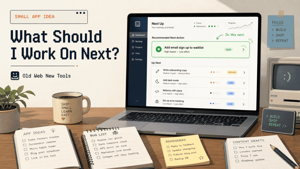
The idea
The app would let a solo builder add tasks, bugs, ideas, content drafts, experiments, and maintenance jobs across different projects. Instead of showing everything as a flat list, it would rank the work based on practical signals like effort, impact, urgency, whether something is blocking progress, and how stale the task has become.
The homepage should be deliberately simple. It might show one recommended task, two backup options, and one quick win.
The useful part is not that the app stores tasks. Plenty of apps already do that.
The useful part is that it helps decide which task is worth doing next and explains why.
That explanation matters. If an app says “do this” without context, it feels like a random algorithm wearing a nice interface. If it says “do this because it’s low effort, blocks a launch, and has been sitting for two weeks,” the recommendation becomes much easier to trust.
That’s the difference between a todo list and a decision helper.
Who it helps
This would be for solo builders, solopreneurs, indie hackers, freelancers, creators, beginner developers, and small business owners who are juggling more ideas than they can realistically finish.
It’s especially useful for people who have several small projects running at once, because that’s where normal task lists start to become noisy. One project has a bug. Another needs a landing page tweak. Another has a content idea sitting there going stale. Another needs a boring admin job done before anything else can move.
A normal task list will happily show all of that as if every item deserves the same kind of attention.
This app should be smaller and more opinionated than that.
It probably wouldn’t be a good fit for large teams. They already have tools built around assignments, sprints, permissions, roadmaps, and reporting. This should not try to become that world in miniature.
The target user is one person trying to make better daily decisions without spending half the morning rearranging cards in a project management app.
A good user might be someone with a small SaaS experiment, a content site, a few automation scripts, and a backlog full of “I should really fix this” notes. They don’t need enterprise planning. They need a calm little screen that says:
Start here.
That’s the whole promise.
The problem
Solo builders often collect work faster than they complete it.
That’s normal, but it creates a strange kind of drag. Every unfinished idea keeps a tiny bit of attention attached to it, and after a while the whole system starts to feel heavier than it should.
The annoying thing is that not all tasks are equal.
A two-minute copy fix might make a landing page clearer. A boring bug might be blocking signups. A content idea might be time-sensitive. A feature idea might feel exciting but have no obvious payoff. A normal todo list usually shows all of these in the same basic way, unless the user spends time manually organising everything.
That’s where this app has room to be useful.
It doesn’t need to replace thinking, and it shouldn’t pretend to know the builder’s life better than the builder does. But it can reduce the friction around choosing.
Instead of asking the user to review fifty tasks, it can surface the few that have the best case for being done now.
That might sound small, but “what should I do next?” is one of the most expensive little questions in solo building.
It burns time. It burns energy. And sometimes it sends you toward the fun task instead of the useful one, which is deeply relatable and not always helpful.
Why it might work
This idea works best if it stays focused on decision support rather than task storage.
There are already too many places to dump tasks, notes, and ideas. The more interesting product is the one that helps a builder move from:
I have too much open.
to:
This is the next sensible thing.
The ranking system doesn’t need to be clever at first. In fact, it’s probably better if it starts simple and explainable. A rough score based on impact, urgency, effort, blocker status, and age would already be more useful than a giant unsorted backlog.
The app could also let the user adjust the weighting, because different builders care about different things.
Some want quick wins. Some want revenue work. Some want to clear blockers. Some want to revive stale projects before they disappear completely into the “later” fog, where old ideas go to become browser bookmarks and mild guilt.
The key is that the app should feel like a filter, not another inbox.
If it turns into a place where people maintain a beautiful task database and still avoid doing the work, it has missed the point.
The app should keep asking one boring but useful question:
Does this help the user choose and do the next useful thing?
If not, it can wait.
Minimum viable version
The first version could be very small.
I’d avoid integrations, team features, AI planning agents, mobile apps, calendar syncing, and complicated goal systems until the core loop proves itself.
A basic MVP could have:
- a task capture form
- projects or categories
- task type
- effort score
- impact score
- urgency score
- blocker status
- optional deadline
- notes
- status
- a simple recommendation view
The task types could stay plain: bug, feature, content, admin, research, maintenance, and idea.
That gives the app enough structure to make useful recommendations without turning task entry into paperwork.
The scoring formula could also be simple at the start:
priority = impact + urgency + blocker value + staleness bonus - effort penaltyThat formula won’t be perfect, but perfect isn’t the goal for version one.
The goal is to create a recommendation that is clear enough to test. If the app can consistently help someone pick a better task than they would have chosen from a messy list, the idea has legs.
If it just creates a prettier backlog, it doesn’t.
Brutal, but fair.
Useful data sources
The earliest version should probably rely on manual input.
That sounds less exciting than automatic imports, but it keeps the build realistic and makes the product easier to test. Manual input also forces the app to prove that the recommendation view is useful before the builder spends weeks wiring up integrations.
Later versions could connect to GitHub issues, Trello cards, Notion databases, Linear issues, Google Calendar, simple CSV uploads, or website analytics. Those integrations would make sense once the product has a clear reason to exist.
Before that, they’re mostly a way to make the app look more impressive while making it harder to finish.
A good middle step would be a messy inbox. Let the user dump rough tasks quickly, then clean them up later.
That fits how solo builders actually work. Most of the time, ideas don’t arrive as neat little database records with a perfect priority score. They arrive as half a sentence, a screenshot, a bug note, a voice memo, or a “fix this later” thought written at 11:38pm by someone who believed tomorrow-me would understand.
Tomorrow-me rarely understands.
Give tomorrow-me an inbox.
Habit loop
The daily habit loop should be short:
- Open the app.
- See the recommended task.
- Understand why it was chosen.
- Do the work.
- Mark it done.
- Move on.
That’s the part I’d protect most carefully.
A tool like this can easily become a productivity toy, where the user spends more time tuning the system than doing anything useful. The app should push against that by making the daily screen small and opinionated.
A simple weekly review could help too.
It might show what got finished, which projects moved forward, which tasks are becoming stale, and whether the user keeps skipping the same kind of work.
That last signal could be useful because repeated skipping usually means something. Maybe the task is too vague, too big, not important anymore, or quietly annoying in a way the user hasn’t admitted yet.
A good weekly review should not become a guilt dashboard.
Nobody needs more software that quietly judges them in pastel colours.
It should just help the builder notice patterns and make better decisions next week.
Possible monetisation
This could work as a small paid utility, but I wouldn’t try to turn it into a huge productivity platform.
The stronger angle is a focused tool for solo builders who want a better way to choose the next action.
A free version could allow a few projects, a limited number of active tasks, and the basic recommendation view. That would be enough for people to test whether the workflow fits them.
A paid version could add unlimited projects, custom scoring rules, weekly reviews, recurring tasks, saved filters, and a few carefully chosen integrations.
I’d also consider a self-hosted version or one-time purchase, because this kind of audience may include people who like owning their data and running small tools themselves.
The pricing should match the size of the promise.
This is not a “run your whole company” tool. It’s a small decision helper. That can still be worth paying for, but the product should stay honest about what it is.
A small tool with a clear job is allowed to charge money.
It just shouldn’t dress up as an operating system for human achievement, because please no.
Risks and weaknesses
The biggest risk is that this becomes just another todo app with a nicer homepage.
That’s the trap.
If the app spends too much time on boards, labels, due dates, views, and productivity aesthetics, it loses the thing that makes it interesting.
The second risk is trust.
If the app recommends the wrong task too often, people will ignore it. That doesn’t mean every recommendation has to be perfect, but it does mean the scoring should be visible and adjustable. A user should be able to understand why something was ranked highly and correct the app when it gets their priorities wrong.
Manual input is another weak point.
If adding a task takes too long, people won’t bother. The capture flow has to be fast enough for rough notes, not just polished tasks. A quick-add box with optional fields would probably be better than a form that demands everything upfront.
There’s also a product temptation here: adding AI too early.
AI could help, but if the first version becomes an AI life coach for your backlog, it’ll probably get vague and annoying. The more useful version is quieter. It helps sort the work, explains the recommendation, and gets out of the way.
The product should not say:
You are entering a new era of intentional productivity.
It should say:
This one is blocking your launch and it’s small enough to finish today.
Much better.
Much less likely to make me close the tab.
How AI could help build it
AI would be useful for building the first version, especially if the scope stays tight.
It could help draft the database schema, generate CRUD screens, write the first scoring function, create sample task data, and turn messy notes into structured tasks.
I’d also use AI to explore different ranking formulas. For example, you could ask it to compare a few scoring models for solo builders:
- one biased toward quick wins
- one biased toward revenue
- one biased toward clearing blockers
- one biased toward neglected projects
That would give you a decent starting point without pretending the model is smarter than it is.
Where I’d be careful is letting AI design the entire product.
This is exactly the kind of small app where AI might drift toward generic dashboards, overbuilt settings, and features that sound useful but weaken the core loop.
The product needs a clear rule:
Help the user choose the next useful task.
Anything that doesn’t support that can wait.
That rule should go in the project prompt, the README, the product notes, and possibly on a sticky note near the coffee.
AI is fast.
Fast needs fences.
A possible first build plan
If I were building this as a solo project, I’d start with the smallest version that proves the recommendation loop.
The first pass could be a simple PHP/MySQL app with server-rendered pages, because the product does not need a rich frontend to prove the idea. It needs a quick capture flow, a visible recommendation, and a way to mark work as done.
The database could start with three core tables:
- projects
- tasks
- task_events
The projects table would store the project name, description, and status. The tasks table would store the actual work: title, notes, type, effort, impact, urgency, blocker status, deadline, status, and timestamps. The task_events table would keep a lightweight history of completions, skips, score changes, and edits.
That’s enough to build the first loop.
The home page would show the current recommendation, two alternatives, one quick win, and maybe a small “why this?” panel explaining the score. The task list would exist, but it should not be the main event.
This is important because the app should not reward backlog gardening.
The core screen should reward doing the next useful thing.
A first version could be built in a weekend if you keep it boring enough.
Naturally, keeping it boring is the hard bit.
What I’d avoid in version one
I would avoid anything that makes the app feel more impressive while delaying the first useful loop.
That includes:
- team accounts
- calendar syncing
- complex recurring schedules
- kanban boards
- AI-generated life advice
- project roadmaps
- mobile apps
- deep integrations
- complicated dashboards
- productivity scoring based on vibes and shame
Some of those could become useful later. The point is not that they’re bad. The point is that they’re not needed to test the idea.
Version one should answer:
Can this app help one person pick a better next task?
If the answer is yes, then you can build from there.
If the answer is no, no amount of integrations will save it.
That’s the annoying thing about product ideas. The simple part has to work first.
Final verdict
I’d build this as a tiny decision-first app for solo builders, not as another all-purpose productivity system.
The first version only needs task capture, a simple scoring model, a recommendation view, and a way to mark work as done.
The best version would feel almost boring. You open it, it shows the next sensible task, it explains the reasoning, and then it gets out of the way.
For people juggling too many small projects, that might be much more useful than another beautiful backlog.
The key is restraint.
If the app becomes a task database, it’s ordinary.
If it becomes a dashboard, it’s probably too much.
If it becomes a daily decision helper that quietly points you toward the next useful thing, then it has a real reason to exist.
That’s the version I’d want to use.