In this article
- A useful app needs to explain itself
- Adding real navigation
- The About page had a job
- The How-To page made the app less mysterious
- The update log became part of the product
- Documentation is product design
- It also helped me understand the app better
- Building pages in a small PHP app
- What worked
- What still needs work
- What I learned in Week 4
By Week 3, EVE Profit Routes had started to feel like a working tool. The app could show route opportunities, score them, sort them, and give the pilot a cleaner way to compare what was worth checking.
That was good. Lovely, even.
But it also created a new problem.
The more useful the app became, the more it needed to explain itself. Not in a corporate onboarding-video sort of way, where everyone smiles too much and the word “seamless” turns up uninvited. More in a plain “what is this, how do I use it, and why should I trust it?” sort of way.
A route tool is not just a screen full of numbers. If it’s going to recommend trade runs, the player needs some context. What does the app do? What is it trying to calculate? How should someone read the route list? What changed recently? What is still being worked on?
That’s what Week 4 was about.
The main job was adding the supporting pages: navigation, an About page, a How-To page, and an update log.
It doesn’t sound like the exciting part of building an app, but honestly, it made the project feel much more real.
A useful app needs to explain itself
There is a point in every small web project where the main screen is not enough anymore.
At the start, that’s fine. You’re just trying to make the thing work. A homepage with a form, a table, and some output is enough while the app is still forming.
But once the tool has a real purpose, a few working features, and a chance of being used by someone who isn’t you, it needs some supporting structure.
For EVE Profit Routes, the main page was answering the practical question:
What should I haul right now to make ISK?
The supporting pages needed to answer the questions around that:
- What is EVE Profit Routes?
- Who is it for?
- How should the route data be read?
- What do the scores mean?
- What changed recently?
- What’s coming next?
Those questions matter because a market tool asks the player to make a decision.
They may spend ISK, move cargo, commit time to a route, or ignore another opportunity because this one looks better. The app doesn’t need to guarantee anything, because EVE is EVE and chaos is part of the furniture, but it does need to be honest about what it’s doing.
That’s where the About, How-To, and Updates pages came in.
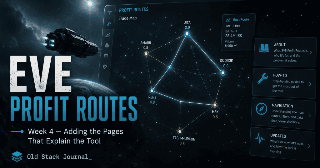
Adding real navigation
The first step was making the site easier to move around.
Before this stage, the app was mostly focused on the main route screen. That made sense early on, but once there were extra pages, the layout needed proper navigation.
I added a navigation partial, which meant the site could have a consistent top-level menu instead of each page feeling like its own tiny island.
In a small PHP app, that kind of shared view is simple but useful.
A rough version of the nav structure looked like this:
<nav class="site-nav">
    <a href="/">Routes</a>
    <a href="/scanner">Scanner</a>
    <a href="/howto">How-To</a>
    <a href="/about">About</a>
    <a href="/updates">Updates</a>
</nav>
The exact markup changed as the app evolved, but the idea was straightforward: the app needed a few obvious places to go.
Routes were the main tool. Scanner would become the item lookup feature. How-To explained how to use the thing. About explained what it was. Updates showed what had changed.
That’s a small amount of navigation, but it gave the project shape. It stopped feeling like a single-page experiment and started feeling like a small web app with a purpose.
The About page had a job
The About page was not there to make the app sound bigger than it was.
That’s a trap with small projects. It’s easy to write an About page that sounds like a startup pitch, full of phrases about empowering users, unlocking insights, and whatever else comes out when coffee and LinkedIn have a terrible child.
That wasn’t the point here.
The About page needed to explain the app plainly. EVE Profit Routes is a tool for EVE Online market traders and haulers. It looks at route opportunities between trade hubs and tries to help the player decide what is worth running.
A good About page for a small tool should tell the reader what the thing is, who it’s for, what problem it solves, and what it is not pretending to be.
In this case, the important part was making it clear that EVE Profit Routes is not a full market dashboard, a guaranteed profit machine, or a replacement for player judgement.
It’s a decision assistant.
The app can help surface opportunities, but it can’t remove EVE risk. It can’t promise that a market will still look the same when you arrive. It can’t save you from gate camps, bad timing, thin volume, or another player doing something deeply inconvenient.
And in EVE, there is always another player ready to do something deeply inconvenient.
The How-To page made the app less mysterious
The How-To page is probably more important than the About page from a practical point of view.
A tool can make sense to the person building it and still be confusing to someone arriving cold. That’s especially true with an EVE market tool, because the player may understand the game but not understand how this particular app is ranking or filtering opportunities.
The How-To page needed to explain the basic workflow without turning into a manual nobody would read.
The rough flow was:
- Pick a starting hub.
- Choose a cargo profile.
- Refresh the route list.
- Look at the top routes.
- Check the score, profit, jumps, confidence, and freshness.
- Use the recommendation as a starting point, not gospel.
That kind of page is easy to underestimate. It doesn’t add a flashy feature, but it reduces uncertainty. It tells the player how to approach the tool.
For a decision-first app, that matters.
The app should not just show a recommendation and hope the user understands the logic. It should teach them enough to read the output with a bit of confidence.
The update log became part of the product
The update log started as a way to record what changed, but it quickly became more than that.
For a small project, an update log is a trust signal. It shows the app is being worked on. It shows what features have been added. It explains why changes were made. It gives returning users a quick way to see whether the tool has improved since they last opened it.
The update page used a timeline-style layout, with entries for each feature stage.
A simplified entry looked like this:
<section class="update-entry">
    <div class="update-date">APR 2026</div>

    <div class="card update-card">
        <h2>Phase 2 — Decision Scores</h2>

        <div class="update-impact">
            Routes are now easier to compare because the app gives each run a clearer quality signal.
        </div>

        <ul class="update-list">
            <li>Added visible decision scores to route cards</li>
            <li>Improved route quality labels</li>
            <li>Made stronger routes easier to scan</li>
        </ul>
    </div>
</section>
That format did two things at once.
It documented the build for me, and it explained the product to users.
Instead of only saying “feature added”, the update log could say why the feature mattered. That is much more useful.
A player doesn’t really care that a commit changed a view file and a CSS file. They care that the app is now easier to scan, or that routes are ranked more clearly, or that the scanner can search items faster.
The update log translated development work into user-facing progress.
That’s not glamorous. It is useful, though, which is annoyingly often the better thing.
Documentation is product design
This was the big Week 4 lesson:
Documentation is not separate from product design.
That sounds a bit grand for a few small PHP pages, but it’s true. The way you explain a tool affects how people use it.
If the About page says the app is a market dashboard, people will expect a dashboard.
If the How-To page tells them to treat the top route as a starting point, not a guaranteed answer, they will use it with better expectations.
If the update log explains that scores are meant to support decisions rather than replace judgement, that shapes trust.
Good documentation doesn’t just describe the product. It frames the product.
For EVE Profit Routes, that framing matters because the tool sits inside a messy game economy. Market data changes. Route safety changes. Player behaviour changes. A recommendation is useful, but it is still a recommendation.
The supporting pages gave me a place to be clear about that.
It also helped me understand the app better
Writing the supporting pages helped me understand the product better.
That happens a lot with writing. You think you know what a thing is, then you try to explain it in plain language and suddenly notice the fuzzy parts.
When I wrote about EVE Profit Routes, I had to be clearer about what it was trying to do. Was it a market scanner? A route finder? A hauling assistant? A trade dashboard? A personal recommendation tool?
The best answer was still the simplest one:
It helps EVE players find trade routes worth checking and running.
That explanation made some product decisions easier.
If a feature helped with finding, understanding, or running a route, it probably belonged. If it was just interesting market data, it might need to wait.
The pages were not just for users. They were also a mirror for the product.
A slightly annoying mirror, but useful.
Building pages in a small PHP app
Technically, this stage was not complicated.
I added a page controller and view templates for the static pages, then wired them into the router.
A simple page controller approach works well for this kind of project. The app doesn’t need a whole CMS inside it. It just needs a few pages that use the same layout as the rest of the tool.
A basic pattern looks like this:
final class PageController
{
    public function about(): void
    {
        View::render('pages/about', [
            'title' => 'About',
        ]);
    }

    public function howto(): void
    {
        View::render('pages/howto', [
            'title' => 'How To Use EVE Profit Routes',
        ]);
    }

    public function updates(): void
    {
        View::render('pages/updates', [
            'title' => 'Updates',
        ]);
    }
}
That’s enough for now.
The pages can live as simple views, share the main layout, and be easy to edit as the app changes.
This is one of the reasons I still like simple PHP for small tools. Adding a few pages does not require a build pipeline, a content model, a headless CMS, or an argument with a JavaScript framework at midnight.
It can just be a controller, a view, and some HTML.
For this kind of app, that’s perfectly fine.
What worked
The navigation made the app feel more complete. It gave the project a clearer structure and made the main tool feel like part of a small site rather than a single loose page.
The About and How-To pages helped explain the purpose of the app without needing to overload the main route screen. That matters because the main screen should stay focused on the decision. It should not have to carry every explanation at once.
The update log was the surprise win. It gave the project a visible development history, but it also became a way to translate technical changes into practical user benefits.
That’s useful for users, and honestly, useful for me as the person building it.
It is much easier to keep a project coherent when you keep writing down what changed and why.
What still needs work
The supporting pages were useful, but they were still early.
As the app changes, the How-To page will need to stay current. That is always the annoying bit with documentation. The moment the product changes, the docs can quietly become wrong.
The update log also needs discipline. If every tiny tweak gets an entry, the page becomes noisy. If only large changes get entries, smaller useful improvements disappear.
The trick is to write updates around user-facing value, not around every commit.
There is also the question of how much to explain. EVE players are often comfortable with complexity, but that doesn’t mean every page should become a wall of detail.
The app needs enough explanation to build trust without turning into a textbook.
That balance will probably keep changing as the tool gets more features.
What I learned in Week 4
Week 4 taught me that supporting pages are not just filler.
For a small app, they can do a lot of work.
They explain the purpose of the tool. They set expectations. They reduce confusion. They show progress. They give the project a bit of shape. They also force the builder to describe the product in plain language, which is sometimes more useful than another coding session.
For EVE Profit Routes, the About page, How-To page, navigation, and update log helped turn the app from a working screen into something that felt more like a real tool.
It still needs more features, and the core route engine still has plenty of growing up to do, but the app can now explain what it is trying to be.
Next, the project moves back into functionality with the Trade Item Scanner. That feature opens a different path through the same data: instead of only asking “what route should I run?”, the player can start asking, “is this specific item worth trading?”