In this article
In Week 1, the main job was getting EVE Profit Routes into a shape where it could exist as a real web app. It had a simple structure, a clear product question, and enough of a foundation to start doing useful work.
The question was still the same one that started the project:
What should I haul right now to make ISK?
Week 2 was where that question started to become harder.
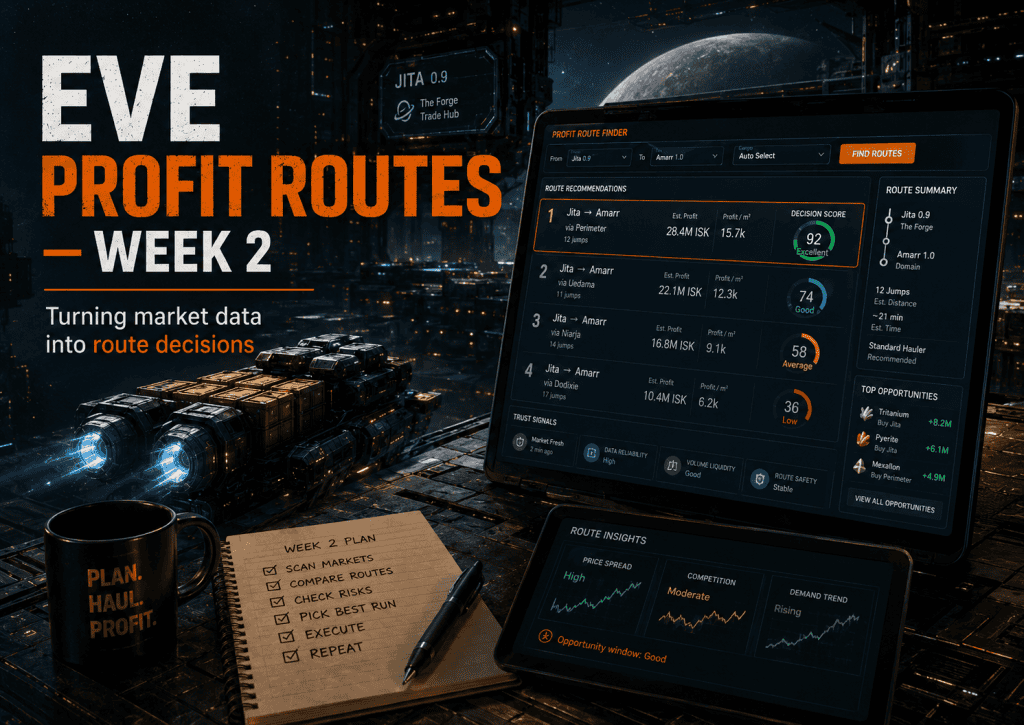
Once the app can show route opportunities, the next problem is deciding which opportunities deserve attention. That sounds like a technical task at first. Pull some prices, calculate the margin, sort the routes, and show the best one at the top.
Lovely idea. Also not quite enough.
Market tools are rarely that clean in practice, especially in EVE. A route can look profitable and still be a bad run. The price gap might be good, but the volume might be thin. The route might have too many jumps. The data might be stale. The item might fit badly into the selected cargo profile. The margin might look exciting because one side of the market is weird, not because there is a reliable hauling opportunity.
That was the real Week 2 problem:
EVE Profit Routes needed to move from showing data to making a judgement about the data.
Not magic judgement. Not “trust me, bro” judgement. Just enough product logic to help the player see which routes were probably worth checking first.
Raw profit wasn’t enough
My first instinct with this market route tool was to sort by profit.
That’s useful, but only up to a point.
If one route says it could make 80 million ISK and another says it could make 30 million ISK, the 80 million route looks better on paper. But that number doesn’t tell the whole story.
If the bigger route needs a large cargo hold, has poor volume, uses older market data, runs through more awkward space, or requires a long trip for a thin opportunity, it might not be the route a player should run first.
This is where things started to get interesting. I didn’t just need a profit calculator. I needed a way to express route quality.
That meant the app needed to consider things like margin, estimated profit, number of jumps, confidence, cargo fit, data freshness, and whether the result looked practical enough to run. Some of those values come from the database and market data. Some come from product judgement about what makes a route useful.
The important shift was this:
The score wasn’t just a number. It was an opinion about what kind of route deserved attention.
That sounds a bit grand, but it’s true. Ranking is where the product starts to show its values.
Adding a visible decision score
One of the first Week 2 changes was adding a visible decision score to the route cards and selected run view.
The commit added a scoring helper in the main home view, then used that class to style routes based on score ranges.
The helper was simple:
$scoreClass = static function (array $route): string {
    $score = (int) ($route['display_score'] ?? 0);

    return match (true) {
        $score >= 90 => 'score-excellent',
        $score >= 75 => 'score-strong',
        $score >= 60 => 'score-decent',
        $score >= 40 => 'score-weak',
        default => 'score-ignore',
    };
};
That’s not complex code, but it changed how the app communicated.
Instead of showing a score as a plain number, the UI could now treat the score as a signal. A strong route could look strong. A weak route could be visually downplayed. The number had a label and a style, which made it easier to scan quickly.
The selected route panel also changed from a plain stat chip into a decision score chip:
<div class="stat-chip decision-score-chip <?= e($scoreClass($selectedRun)) ?>">
    <span class="small muted">Decision score</span>
    <strong class="decision-score-value"><?= (int) ($selectedRun['display_score'] ?? 0) ?></strong>
    <span class="decision-score-label"><?= e((string) ($selectedRun['display_score_label'] ?? 'Weak')) ?></span>
</div>
This was a small UI change, but it mattered because the app is supposed to reduce hesitation.
If the player has to inspect every number manually, the tool is not doing enough work. A decision score gives the route list a clearer hierarchy.
The score doesn’t remove the need for judgement, and it shouldn’t pretend to be perfect. It just helps the player understand which routes are worth looking at first.
Ranking is product judgement
The more I worked on the scoring layer, the more obvious it became that ranking is not just maths.
A formula can calculate a margin. It can divide profit by jumps. It can compare cargo size against available capacity. But the product still needs a point of view about which trade-offs matter.
For EVE Profit Routes, the ranking has to reflect the reality of actually hauling.
A short route with slightly lower profit may be more useful than a long route with a higher theoretical payout. A route with fresh data and decent market depth may be safer than one with a huge spread but weak confidence. A run that fits a smaller cargo profile may be more practical for more players than one that assumes a larger ship.
That’s why I think of the score as product judgement encoded into the app.
It is not just asking:
Which row has the biggest number?
It is asking:
Which route is most likely to be worth a player’s time right now?
That question is harder, but it is also the point of the tool.
Adding character location context
The other big Week 2 change was character location context.
The app already cared about trade hubs, but the player’s current character also matters. A route that starts in Jita is much more convenient if the player is already near Jita. If they are many jumps away, the route may still be useful, but the app should at least make that visible.
This meant pulling in location context through EVE’s ESI API and tying it back to the selected starting hub.
The commit added location cache clearing during auth cleanup, extra ESI client support, route quality logic, and home controller changes to pass selected hub context into the page.
Part of the controller work was about keeping track of the selected region rather than only the selected region ID:
$selectedRegionId = null;
$selectedRegion = null;

foreach ($regions as $region) {
    if (($region['trade_hub_name'] ?? '') === $hub) {
        $selectedRegionId = (int) $region['id'];
        $selectedRegion = $region;
        break;
    }
}
That looks small, but it matters because later logic needs the selected region as real context.
The app is not just filtering by a hub name. It is starting to understand that a selected hub belongs to a system, a region, and a route decision.
Location context also has an important product function: it makes the recommendation more honest.
If a route looks good but the character is far away from the selected hub, the player should know that before committing to the run.
That doesn’t mean the app should hide the route. It just means the app should stop pretending all starting points are equal.
Why trust signals matter
A recommendation without trust is just a guess with styling.
That became a recurring theme in the app.
If EVE Profit Routes says a run looks good, the user needs to know why. A score helps, but it is not enough by itself. The app also needs supporting signals: freshness, confidence, route length, market depth, fill likelihood, wallet context, and character location.
Some of that logic appears in the route model as explanation text.
For example, the route can build a set of reasons based on margin, visible volume, jumps, data freshness, and confidence:
$why = [];

if ($marginPercent >= 15) {
    $why[] = 'Strong margin: ' . number_format($marginPercent, 1) . '% spread.';
} elseif ($marginPercent >= 8) {
    $why[] = 'Usable margin with realistic spread.';
}

if ($depthRuns >= 3) {
    $why[] = 'Repeatable volume: about ' . number_format($depthRuns) . ' visible runs.';
} elseif ($depthRuns >= 1) {
    $why[] = 'Executable volume for the current run size.';
}

if ($jumps <= 8) {
    $why[] = 'Short route: ' . number_format($jumps) . ' jumps one-way.';
} elseif ($jumps <= 14) {
    $why[] = 'Manageable route length for a focused hauling session.';
}

if ($freshnessMinutes !== null && (int) $freshnessMinutes <= 30) {
    $why[] = 'Recent market data supports this pick.';
}

if ($confidence === 'high') {
    $why[] = 'High confidence score after margin and liquidity filters.';
}
This is the kind of logic that makes a market tool feel more useful.
The app is not only showing the result. It is beginning to explain why the result exists.
That matters because players are making a choice with consequences. They may spend ISK buying stock. They may commit time to a route. They may move cargo through space where other players can blow them up, because EVE is a game with a deep commitment to inconvenience.
The app doesn’t need to make the decision risk-free, because EVE doesn’t work that way. But it should give enough context to make the recommendation inspectable.
The UI had to carry the judgement
Once the app had a decision score, the interface needed to make that score readable.
This is where the styling work came in.
A score hidden in a plain table cell is technically present, but it doesn’t do much. A score with a label, colour treatment, and consistent placement becomes part of how the user reads the page. The route list can start to feel ranked instead of dumped onto the screen.
This is one of those small product details that is easy to dismiss as visual polish.
It isn’t.
For a decision tool, presentation affects whether the user can act quickly.
The score styling gave the app a way to separate excellent, strong, decent, weak, and ignorable routes without forcing the user to manually interpret every number. It also set up later work where the best runs, selected run, and execution flow could all reuse the same score language.
The more consistent the signals are, the easier the app is to trust.
What worked
The decision score was useful because it gave the app a stronger hierarchy.
Routes were no longer just a list of opportunities. They had a visible quality layer.
The location context also made the app feel more grounded. EVE route decisions are not abstract. They happen from the point of view of a character in New Eden. Adding the character’s relationship to the selected hub moved the app closer to how players actually think.
The best part of the Week 2 work was that it kept the original product direction intact.
The app was still not trying to become a giant market dashboard. It was becoming better at answering the same question from Week 1:
What should I haul right now?
That was the right direction.
What still needed work
The scoring layer was only the beginning.
A score can help, but it can also create false confidence if the supporting signals are weak. If the data is stale, the market depth is thin, or the route is impractical, the score needs to reflect that clearly.
That meant later work would need to keep improving the route quality logic. It also meant the interface would need more than one signal.
A single number is useful, but a route recommendation is stronger when the app also explains freshness, confidence, market depth, route length, and practical execution concerns.
There was also a risk of overfitting the score too early.
In a small app, it is tempting to keep tweaking formulas until they look right for a handful of examples. That can be useful during early testing, but the better long-term approach is to keep watching real route outputs and adjust based on patterns.
The score should help the player, not become a magic-looking number nobody can explain.
What I learned in Week 2
The main lesson from Week 2 was that ranking is where product thinking starts to show up in the code.
It is easy to say the app should recommend the best route.
It is harder to define what “best” means.
Is it the most profit? The shortest route? The freshest data? The highest confidence? The best fit for the selected cargo profile? The one closest to the current character?
The answer is usually a mix.
That is why a decision-first app needs more than raw data. It needs a clear opinion about what the user is trying to do.
For EVE Profit Routes, the pilot is not casually browsing market information. They are trying to find a run that is worth acting on.
Week 2 was the first real step toward that. The app gained a visible decision score, stronger route quality thinking, and character location context. It still had a long way to go, but it was starting to behave less like a table of market data and more like a tool that could point the player toward the next useful action.
Next, the problem shifts from scoring to usability.
Once the app has useful route signals, the player needs a better way to filter, sort, and work with them.
That is where Week 3 starts.