In this article
- A WordPress Plugin for Comparing AI Tools Without Losing My Mind
- Why I built it as a WordPress plugin
- The basic plugin structure
- Matching the OSJ theme instead of going full cyberpunk
- The first public version
- The admin editor
- Scoring: keeping it simple
- The front-end layout evolved quickly
- Details panels instead of cramming everything into the row
- Tested status needed to be very clear
- Sticky table header
- Seeding the first 50 tools
- Importing the SQL file locally
- The public page
- What I’d improve next
- The bigger point
A WordPress Plugin for Comparing AI Tools Without Losing My Mind
There are already plenty of AI tool directories online.
Too many, probably.
Most of them feel like someone poured a bucket of logos into a website, added a search bar, sprinkled on some affiliate links, and called it useful. Technically, they are directories. Practically, they often leave you with the same question you had when you arrived:
Which one of these bloody things should I actually use?
That was the itch behind the OSJ AI Tool Matrix.
I didn’t want to build another giant “3,000 AI tools you must try” page. That way lies madness, stale data, and a table full of dead startups wearing nice gradients.
I wanted something more useful.
A single page on Old Stack Journal where you can compare consumer AI tools, coding assistants, app builders, research tools, image tools, video tools, automation tools, and all the other shiny little AI things currently multiplying across the internet.
But the point isn’t volume. The point is judgement.
The matrix should help answer:
Is this tool actually useful, who is it for, what does it cost, where does it break, and has OSJ actually tested it yet?
That’s the whole job.
Not hype. Not magic. Not “this changes everything.”
Just a practical AI tool reference that can grow over time.
Why I built it as a WordPress plugin
Old Stack Journal runs on WordPress. No page builder. No Elementor. No Divi. No visual builder doing 700 mysterious things in the background. Just a normal WordPress site, theme files, SSH access, and the usual amount of mild server-based anxiety.
The first question was whether this should just be a page with a big table in it.
The answer was no.
A hand-edited WordPress table might be fine for 10 or 20 tools, but this project is meant to grow. Once you start adding ChatGPT, Claude, Gemini, Grok, Perplexity, Cursor, GitHub Copilot, Bolt, Lovable, Replit, NotebookLM, Midjourney, Runway, ElevenLabs, Zapier, n8n and the rest, a normal page table becomes a swamp.
A sexy swamp, maybe. But still a swamp.
So the better answer was a custom plugin. The public page stays simple. It just uses a shortcode:
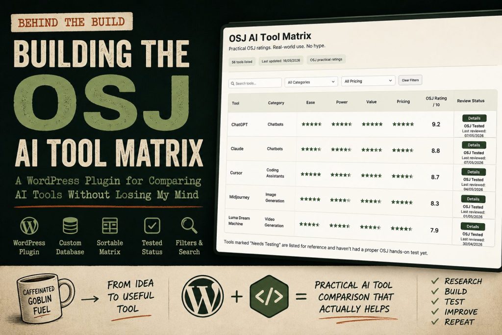
[osj_ai_matrix]The plugin handles the data, the admin screen, the table layout, the filters, the scoring, and the front-end display.
That keeps the content editable inside WordPress, but avoids turning the page editor into a spreadsheet prison.
The basic plugin structure
The first version of the plugin was deliberately boring underneath.
The plugin creates its own custom database table on activation. I went with a custom table rather than a custom post type because this is structured comparison data, not really “posts”. Each tool has scores, pricing, links, status, dates, strengths, weaknesses, categories, and source notes. That fits a proper table better than pretending every AI tool is a blog post wearing a fake moustache.
The database stores fields like:
Tool name
Category
Subcategory
Best for
Ease score
Power score
Value score
Pricing score
Free plan
Starting price
Strengths
Weaknesses
Best user
Skip if
Official link
Pricing link
Review link
Source URLs
Last reviewed
OSJ tested status
The public page then turns that into a searchable, sortable matrix.
Matching the OSJ theme instead of going full cyberpunk
Because it’s an AI matrix, the temptation is obvious.
Black background. Neon green. Glowing lines. Maybe something that looks like it was designed by a crypto exchange at 2am.
I did not want that.
OSJ already has its own feel: warm cream background, green and rust accents, rounded cards, readable type, old-web practicality with a bit of modern polish. The plugin needed to look like it belonged on the site, not like some random SaaS widget had broken in through a window.
So the theme folder got checked first.
That meant matching:
page width
background colour
card styling
button shape
border radius
accent colours
spacing
mobile behaviour
general OSJ rhythm
This matters more than people think. A useful tool can still feel cheap if it looks like it came from another website. The goal was to make the matrix feel like part of OSJ from day one.
Practical. Clean. Slightly handsome. Not trying too hard.
The first public version
The first working version had the basics:
custom plugin
custom database table
admin screen
add/edit/delete tools
shortcode output
search
category filter
pricing filter
sortable columns
scores
strengths and weaknesses
official/pricing/review links
last reviewed date
tested status
The starter set had around 50 tools. That was enough to make the page useful without pretending it was already the final boss of AI directories.
Every starter tool was marked as needing testing because trust matters. I don’t want OSJ saying something has been properly tested if it has only been researched and seeded into the database. That distinction is important.
There is a big difference between:
This tool exists and looks relevant.
and:
I actually used this tool on a real task and have an opinion.
The matrix needs both stages, but it should label them honestly.
The admin editor
The plugin adds an AI Matrix section inside WordPress admin.
Each tool can be edited from there.
The admin screen is not trying to win design awards. It just needs to work. You can update the category, scores, pricing, links, strengths, weaknesses, source URLs, and whether OSJ has tested the tool.
One small but useful field is Source URLs.
That is not meant for the public page. It is an admin note field for the evidence behind a row. Pricing pages, official docs, changelogs, release notes, help pages, anything that explains where the data came from.
Because six weeks from now, when I look at a price and think “where the hell did I get that from?”, I want the answer to be in the admin, not buried somewhere in my browser history next to 400 tabs and a vague sense of regret.
A small note was added beside that field to make it clear:
Private research/evidence links only. Used to track where pricing, features, or claims came from.
That sort of thing sounds boring until you actually need it. Then it becomes a lifesaver.
Scoring: keeping it simple
The scoring system started with the useful bits:
Ease
Power
Value
Pricing
Each one is scored from 1 to 5.
Then the front end calculates an OSJ Rating out of 10.
That rating is not a lab benchmark. It is not science cosplay. It is a practical usefulness score based on the things normal users actually care about.
Is it easy to use?
Is it powerful enough?
Is it worth the money?
Is the pricing sane, or is it one of those “contact sales and bring a lawyer” situations?
That gives visitors a quick way to compare tools without reading every expanded row.
The matrix still shows strengths, weaknesses, best user, and skip-if notes in the details panel, because scores alone are never enough. A tool can be a 9/10 for one person and completely pointless for someone else.
That is where the plain-English notes matter.
The front-end layout evolved quickly
The first layout worked, but tables are awkward little beasts.
The early version was too wide. It created a horizontal scrollbar at the bottom of the rows, which looked clumsy on the page. So the layout had to be tightened.
A few changes helped:
the separate Links column was removed
links were moved into the details panel
the OSJ Rating got its own column
the Details button moved into the Status column
the score columns were tightened
the header spacing was adjusted
The pricing display also changed.
At first, pricing was more text-heavy. Then it became a proper 1–5 score like the other ratings, while the front end still shows useful pricing information in plain English:
Free Plan?: Yes
Starting Price: $20/month
Small wording tweaks make a difference. Labels stop the table feeling like random values floating around.
Details panels instead of cramming everything into the row
One useful decision was to keep the main table fairly compact and put the extra information behind a Details button.
When you click details, the row opens up and shows more context:
Strengths
Weaknesses
Best user
Skip if
Links
The links section uses plain text links rather than chunky buttons:
Official Site ↗
Pricing Page ↗
OSJ Review
That felt cleaner. The main table already has enough going on, and not every link needs to dress up as a button and shout for attention.
The details panel is where the judgement lives. That is the bit that turns the matrix from a spreadsheet into an actual guide.
Tested status needed to be very clear
This one took a tiny bit of fiddling because wording matters.
The admin now has a simple checkbox:
OSJ tested?If it is ticked, the front end shows:
OSJ TestedIf it is not ticked, the front end shows:
Needs TestingThat sounds obvious, but the first version was confusing because the logic felt backwards. When a checkbox exists, people naturally expect ticked to mean “yes, this has been tested.”
So that got fixed.
The front end also drops tools marked Needs Testing to the bottom of the table by default. That way the most trusted entries rise to the top, and the “listed but not fully tested yet” tools are still available without pretending they deserve equal weight.
Again, it is a trust thing.
Sticky table header
Once the table had enough rows, another obvious problem appeared.
You scroll down, and suddenly you forget which score column is which.
Is this 4 for ease? Power? Value? Pricing? Why am I like this?
So the table header needed to stay visible while scrolling.
Adding position: sticky to the header mostly solved it, but there was one annoying issue: the sticky table header jumped to the very top of the browser and covered the site header.
Not ideal.
The fix was to calculate the height of the OSJ site header and make the matrix header stick just underneath it. That way, when you scroll, the main OSJ header stays where it belongs and the table header politely sits below it instead of barging into the furniture.
A small thing, but it makes the matrix much nicer to use.
Seeding the first 50 tools
Manually entering 50 tools through the admin would have worked, but it would also have been tedious enough to make me stare into the middle distance.
So I created a SQL seed file.
The seed file inserts or updates the first batch of tools, including:
ChatGPT
Claude
Gemini
Grok
Perplexity
Microsoft Copilot
Meta AI
DeepSeek
Mistral Le Chat
Poe
Cursor
GitHub Copilot
Claude Code
Codex
Gemini CLI
Windsurf
Replit
Bolt
Lovable
v0
NotebookLM
Midjourney
Ideogram
Leonardo
Runway
Pika
Luma
ElevenLabs
Descript
Canva AI
Gamma
Zapier
Make
n8n
And plenty more.
The seed data includes official sites, pricing pages where possible, starting prices, free plan status, scores, strengths, weaknesses, best-user notes, skip-if notes, source URLs, and random last-reviewed dates within the last eight weeks.
Every seeded tool was set to:
Needs TestingThat means the matrix can launch with useful research data, but OSJ still has a clear review workflow.
Research first. Hands-on testing next. Trust always.
Importing the SQL file locally
For the local copy of the site, the SQL file can be imported directly into the WordPress database.
Something like:
mysql -u DB_USER -p DB_NAME < osj_ai_matrix_seed_50_tools.sqlOr with WP-CLI:
wp db import osj_ai_matrix_seed_50_tools.sqlThe main thing is making sure the table prefix matches.
The SQL file assumed:
wp_osj_ai_matrix_toolsIf the local WordPress install uses a different prefix, the table name has to be changed before import.
Very glamorous stuff. Very “this is why I needed another coffee.”
The public page
The final page lives at:
/ai-tool-matrix/The page itself is simple.
There is an intro explaining what the matrix is, who it is for, and what problem it solves. Then the shortcode renders the matrix.
The page includes:
tool count
last updated date
practical OSJ ratings
filters
search
sortable table
details panels
tested status
last reviewed dates
disclaimer
The disclaimer matters because AI tool pricing and features change constantly. Sometimes publicly. Sometimes quietly. Sometimes in the annoying way where a feature still exists, but only if you are on the right plan, in the right country, logged into the right account, during the correct moon phase.
So the bottom of the table includes a note along these lines:
This matrix is a practical OSJ reference, not a perfect live database. Pricing, free plans, limits, and features change often, sometimes quietly and sometimes annoyingly. I do my damndest to keep it current, but always check the official site before making a paid decision. Tools marked “Needs Testing” are listed for reference and haven’t had a proper OSJ hands-on test yet.
That is the right tone for this kind of project.
Useful, but honest.
What I’d improve next
The plugin is now past the “does this even work?” stage.
It works.
The next stage is making it more useful and more maintainable.
The obvious next improvements are:
bulk edit tools
import/export CSV
separate changelog table
RSS/changelog watcher
pricing change review queue
public “recently updated” section
dedicated tool review pages
better category landing pages
The future version should not automatically publish scraped changes. That is asking for trouble. But automation can absolutely help detect changes.
A sensible workflow would be:
watch official blogs, changelogs, RSS feeds, and pricing pages
detect possible changes
summarise them in admin
mark the tool as needing review
let a human approve the public update
AI can help with the boring monitoring work. It should not be allowed to rewrite public verdicts unsupervised like a caffeinated intern with root access.
The bigger point
The useful lesson here is not “I built a WordPress plugin.”
The useful lesson is that small, focused tools still make sense.
This could have been a Notion database. Or an Airtable embed. Or a Google Sheet. Or some giant JavaScript app with a login system and 14 npm packages called things like ultra-grid-core.
But it did not need that.
It needed:
a WordPress page
a custom plugin
a database table
an admin screen
a shortcode
some CSS
a bit of JavaScript
a clear product idea
That is enough.
Most useful web tools are not complicated because the technology demands it. They become complicated because the idea is fuzzy.
This one has a clear job:
Help people compare AI tools without drowning in AI tool noise.
That is why the OSJ AI Tool Matrix exists.
Not as a hype directory. Not as a logo graveyard. Not as “top 100 tools to 10x your productivity before breakfast.”
Just a practical, growing reference for people trying to work out which AI tools are actually worth using.
And yes, it is still a bit of a database with a pretty face.
But honestly, a lot of useful websites are.